


Bottom of the Ninth (cover) Part 4
Creating my ninth cover for the Baseball Research Journal

Once my concept sketch for the cover of the Baseball Research Journal was approved by the Society for American Baseball Research (SABR) CEO Scott Bush and Publications Editor Cecilia Tan, I began refining my illustration.
The first thing I did was create a much more detailed and larger pencil drawing. I usually do 2 sets of pencils, one group of just the figure and a second set with the background. The reason for several pencil drawings is that sometimes I need to define certain areas more than others, such as a glove or facial features. Once I get those to my liking, I get out my tracing paper and create a black ink outline. It is with the black marker that I draw the image in various thick and thin lines to give it a little life.
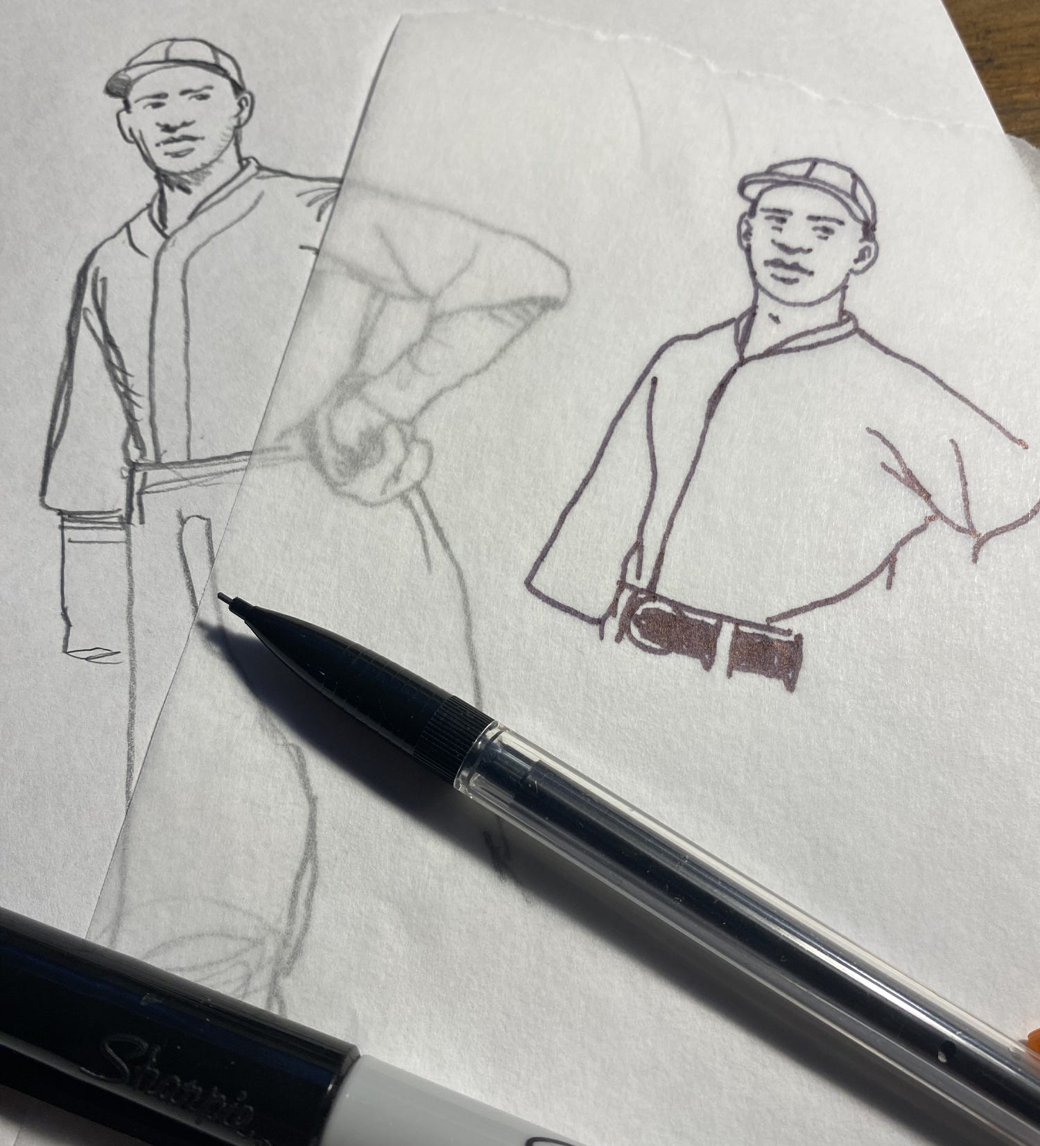
I now combine all the different parts into a single black and white drawing. This is the most crucial part of my technique because whatever I put down in black ink will be the framework that the entire illustration with hang from. If I don’t do this part correct, the whole piece will be a failure.
Now I switch from analog to digital.
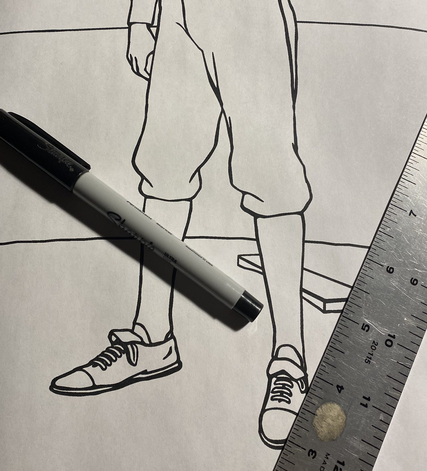
I scan the completed black and white drawing into the computer. There I am able to make small corrections or clean up any mistakes I made on the hand drawn original. Once I get it to a place I am happy with it, I begin adding large blocks of colors into the drawing.
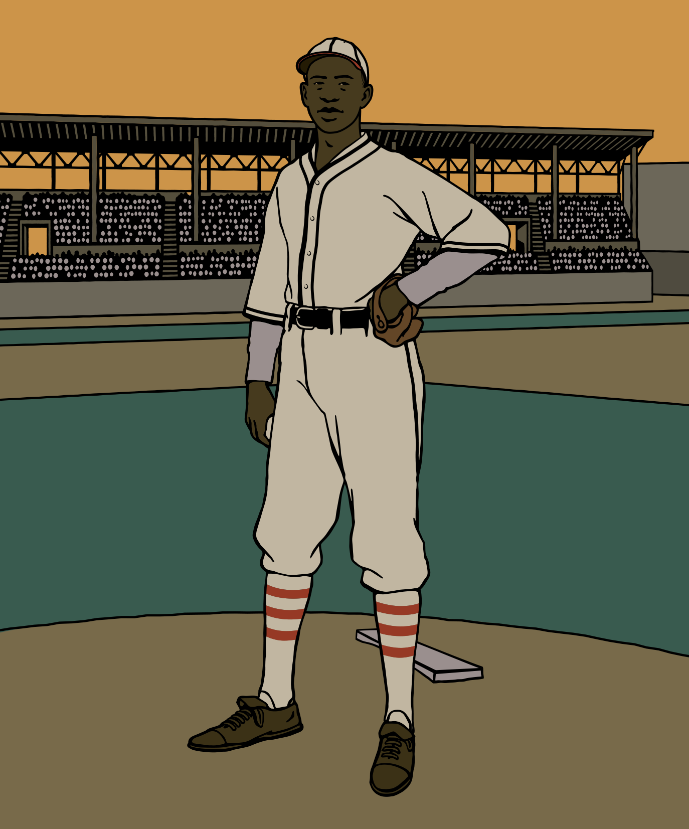
Now it’s starting to look like something, right?
Another important part of my drawings is historical detail. I try my best to illustrate the correct uniforms and caps on my players, and this one of Satchel is no exception.
As I outlined earlier, I wanted to depict Satch during his time pitching for the Kansas City Monarchs traveling team in 1939-40. While researching the Negro American League Monarchs uniforms is relatively easy – there are many team photos and individual player portraits that survive – finding what the TRAVELING Monarchs team wore was another story.
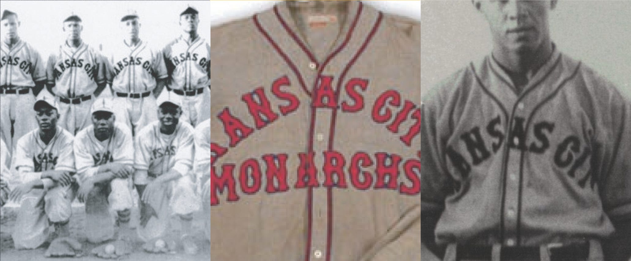
I have an extensive library in my studio and files upon files of notes and sketches of various uniforms from all eras of baseball history. Finding what Paige and the traveling Monarchs wore would be difficult, but not impossible. What I did first was try to find any relevant photos in my Negro League books. I was able to determine that the 1939 league Monarchs wore a jersey with “KANSAS CITY” arched above “MONARCHS” in red letters trimmed in navy blue. There was even an original 1939-40 jersey sold at auction some years back. But that doesn’t mean the traveling team wore that style.
A bit more digging and I found a team photo of a Monarchs team that had a slightly different variation of the auction jersey. The arched “KANSAS CITY” was identical to the auction jersey, but without “MONARCHS” beneath it. Looking closer I could also see that the stirrups worn by this team was different that the ones donned by the league Monarchs during that same period. This had to be a photo of the traveling Monarchs, right?
Well… not so fast.
I needed a bit more proof to satisfy myself. Going through some individual Monarchs player photos, I found a closeup of a catcher named Paul Hardy. In the photo he is wearing the same Monarchs jersey with just “KANSAS CITY” in the arc. Looking closer, I realized that this was actually a closeup taken from that team photo. Now the big question was: Did Paul Hardy play on the regular Monarchs or the traveling Monarchs. A quick look at his profile in the indispensable Seamheads Negro League Database reveals that he appeared in a dozen games as the third-string catcher with the league Monarchs in 1939.
Darn!
At this point I was going to give up, but something made me continue digging, and I’m glad I did. According to several newspaper sources, Paul Hardy also played for the Satchel Paige All-Stars in 1939. That means the probability of that team photo with Hardy was likely the traveling Monarchs team that Satchel Paige pitched for.
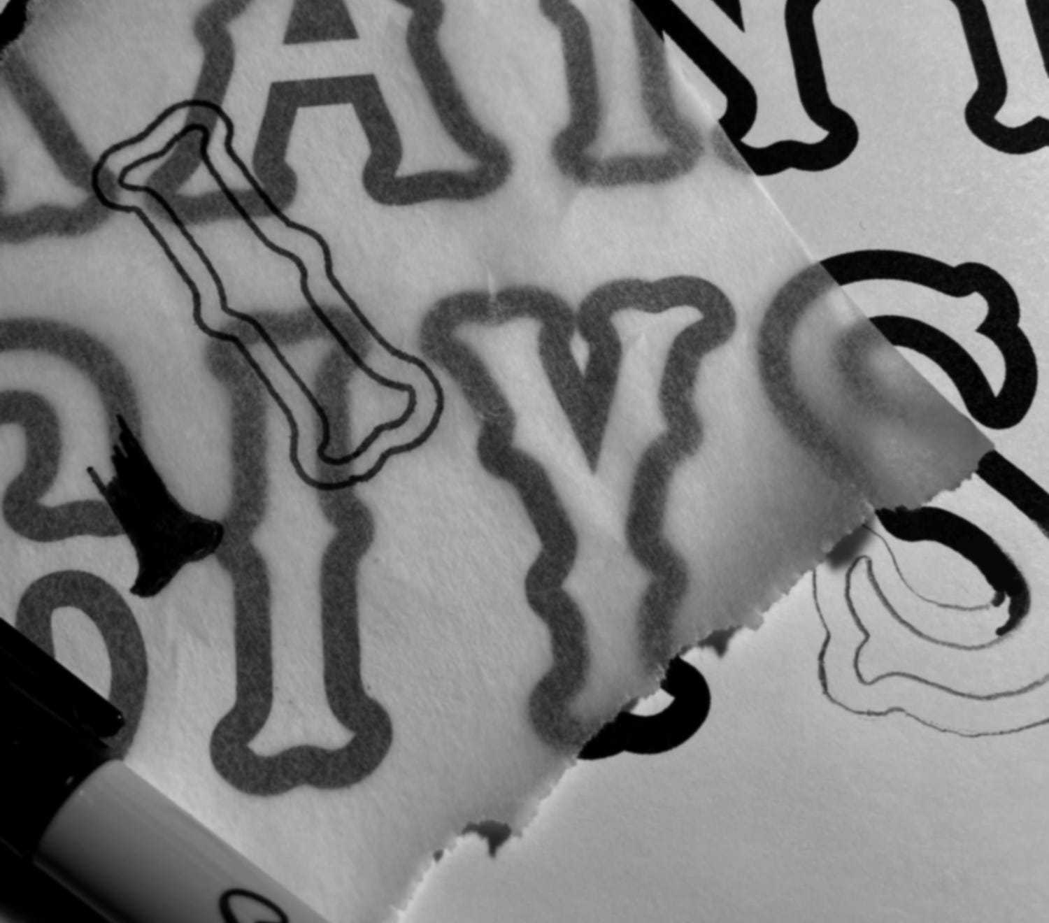
With all the photo research in front of me, I set about recreating the typeface used on the Monarchs jersey. This was a pretty common typeface for baseball uniforms beginning around 1930 and can still be seen today in places such as the Boston Red Sox home uniforms.
For me, this particular typeface is one that I absolutely hate recreating. I’m not quite sure why, but it is probably the lack or any straight lines; it being made up of almost all curves. The rounded serifs (the little parts that stick out on the top and bottom of the letterform) give the whole typeface an uneven quality to me, especially the more letters that are used together. While it looks well balanced on the Red Sox jersey due to it being just six characters broken up into two 3-letter words, the much longer “KANSAS CITY” become unwieldy to my eye. And when you place it on an arc… don’t get me started.
But, as I said, I try to be as accurate as possible so I hand-drew the correct typeface to use in my drawing.
So now I had the correct uniform Satchel Paige would be wearing on the Baseball Research Journal cover.
Next time you’ll see how I pull all these different pieces together as the final cover illustration begins to emerge.