(re)Designing Negro League Logos
Here's a look at some new Negro League t-shirt designs I just finished along with the story of how I created one of them.
If you've been reading my blog for a while, you probably know that one of the many things I've done since starting my own studio is design t-shirts for a couple different apparel companies. As the son of a garment worker and someone who knows his way around a pattern with a Maimin machine himself, I especially enjoy working with textiles and cloth. Plus, having spent my youth creating homemade punk rock t-shirts for my friends and myself, I still have a soft spot for anything printed on a tee.
I have to admit, I swell with pride every time I see "sold out" next to one of my designs or see one being worn out in the real world. In fact, some of you may have met me when I approached you and said pointing to your shirt, "Hey – I designed that!"
In recent times, two of the companies I worked with in the past have gone in different directions or changed customer focus and no longer produce the type of original graphics I specialize in. So, these days you can find my work over at TeamBrown Apparel. I found that working with the owner, Rob Brown, to be quite enjoyable, and the range of product options they have available on which to feature my artwork is very diverse.
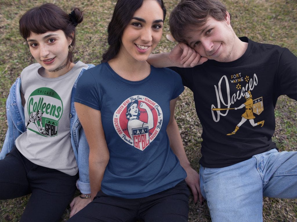
In the past I have done a series of All American Girls Professional Baseball League shirts which have been very popular and can even be found for sale in the Smithsonian Gift Shop (which, for a history geek like me, is pretty exciting).
I also created a "City Series" of popular baseball cities...
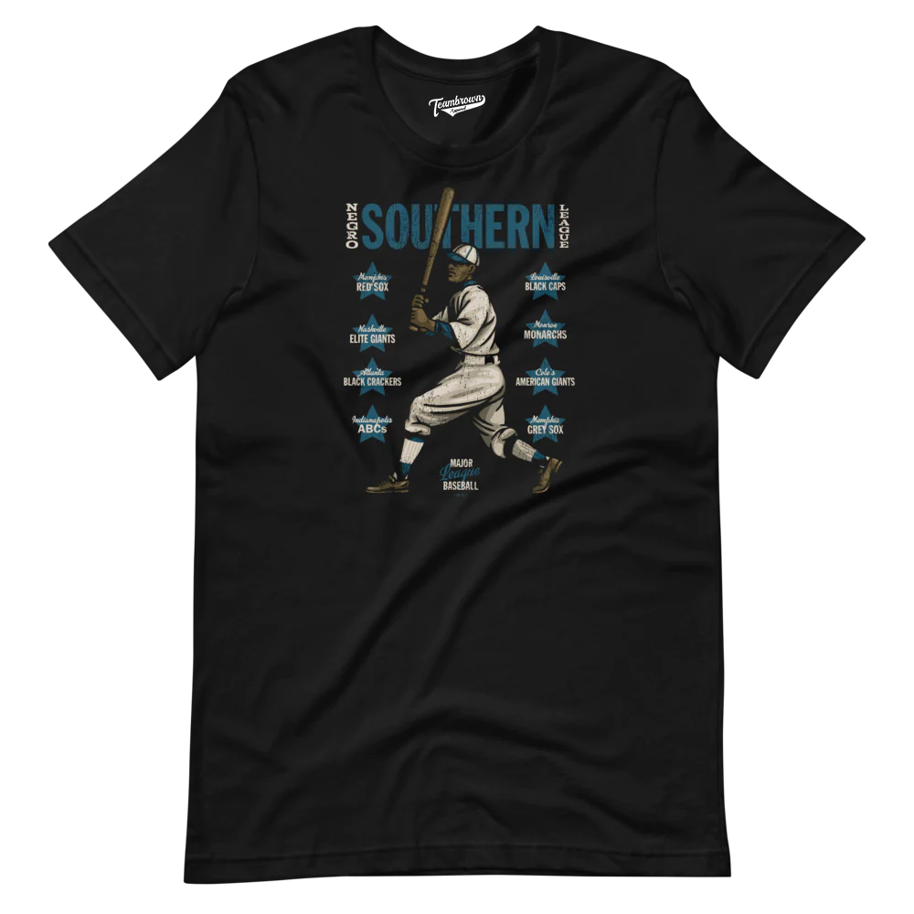
...and a line that features one shirt from each of the seven Negro Leagues acknowledged as "Major Leagues" by MLB.
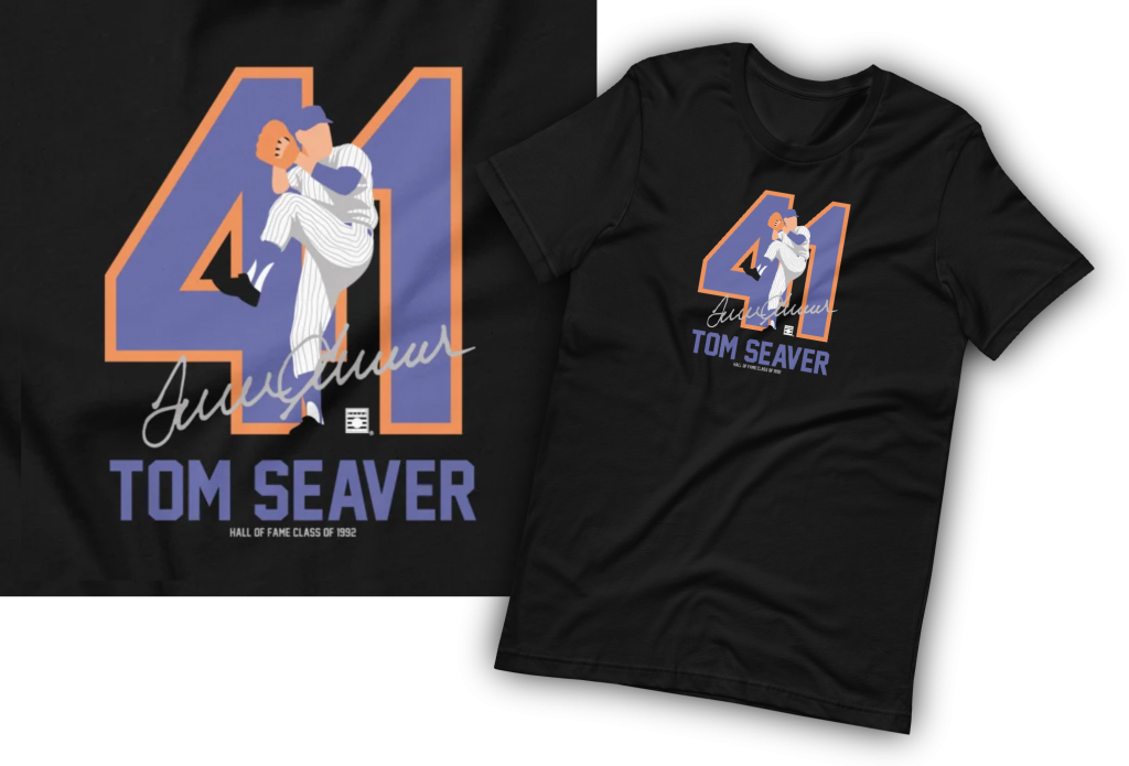
Then there are what I call the "Silhouette Series" of five big-name Hall of Famers in a unique style.
The first line of designs I did with TeamBrown was a series of six Negro National League teams.
Not to toot my own horn too much, but I believed then, and still do, that these are the best Negro League shirts on the market. I tried to create designs that would have looked at home on a scorecard or poster from 1942. It may not be everyone's cup of tea, but to me they not only pay tribute to the men of the old Negro Leagues, but also – and this is the most important part – give these teams an identity, something most did not have back when they played.
By identity I mean a logo or brand. Back before the 1950s or so, a team's identity was not that big of a deal – some teams like the Yankees, Dodgers or Cardinals had jersey graphics that have become iconic through their being more or less standardized from generations. However, other teams, especially in the minor leagues and Negro Leagues did not have a strong visual identity. They changed uniform designs from year to year and did not have a standard logo used consistently.
When it comes to designing a shirt for a Negro League team, there's two options for the artist. The first is to find something the team actually used. This explains the usual block letter "G" for the Homestead Grays or the intertwined "KC" of the Kansas City Monarchs. Unfortunately, these are often simple letterforms and can make for a bland looking design.
The second option for the artist is to create a new logo for the team. This is the path I tend to take. For one, it lets me be more creative than just using something like the aforementioned "block letter "G" for the Grays. This option also allows me to use my knowledge of graphic design history to try to imagine what a team could have had at the time had they had the budget to hire a designer to create something for them.
Which brings me to my second series of Negro League shirts I just designed for TeamBrown.
For this round, I concentrated on some teams I either had some affinity towards (Baltimore Black Sox, Cincinnati Tigers), have not seen many current examples on the market (Columbus Blue Birds, Harrisburg Giants, Memphis Red Sox, Cleveland Buckeyes), or others that I thought I could something different than ones available (KC Monarchs, Birmingham Black Barons).
After I sent the designs off to TeamBrown for production, I was getting ready to toss my sketches, when I thought maybe it would be interesting to go through my process in creating one of the new designs. For this I chose the Black Sox.
(re)DESIGNING THE BALTIMORE BLACK SOX
I had wanted to make a Black Sox shirt for a long time, but I just couldn't come up with a concept I was happy with. The Sox had at least three bespoke logos that appeared on their uniforms during their existence. I decided to see if I could use any of this historic logos as a starting point for my design.
The first proprietary Black Sox logo was a mid-1920s design that featured a fancy intertwined "B" and "S" and was sewn on the left side of their jersey:
Though I like to start with existing historical logos when I can, I did not think this concept would make a compelling shirt design. My reason being that it would be too awkward to try to introduce other text such as "BALTIMORE" and "EASTERN COLORED LEAGUE." I felt that doing so would make the design too cluttered.
The second period logo appeared on the team's caps in 1929 and 1930 and featured a black block letter "B" inside of an orange circle.
This design has to be one of the greatest looking caps in Negro League history. Will Arlt, my late friend and owner of Cooperstown Ballcap Company, dug this awesome design out of the dustbins of history and produced a beautiful replica back in the 1980s.
While this made a very striking and original ballcap, there were a couple reasons I did not use this for the basis of my design.
The main reason was that it was too simple. The only way to introduce other text into the design would be to wrap it around the outside of the circle. This leads me to the other reason I did not choose to go with this design – there's like 800 t-shirt companies that offer a Black Sox shirt that has the text wrapped around the circle. I wanted to do something different.
The third logo used by the Black Sox dates from 1933. That season a legal battle led to the team management splitting into two entities. One group was allowed to keep the players while the other kept the team name "Black Sox." The nameless group played under the name "Baltimore Sox" for the season and jerseys were made up that featured the "S" with smaller "o" and "x" inside of it. The design wasn't completely original as several teams have used this concept over the years, most notably the Chicago White Sox.
Though it is hard to see in the newspaper photo, the closeup is a pretty accurate reproduction of the 1933 logo patch by Ebbets Field Flannels. And, like the black "B" in the orange circle, this design appears more or less exactly the same on a variety of other Black Sox shirts already on the market.
To separate from the pack and make my design more visually compelling, I did a quick exploration page of sketches to see what looked interesting.
I decided to take a cue from examples of logo design of the 1920s and place my text inside the "S" to create a self-contained unit.
I think this took an already attractive concept and freshened it up by making the text a little more more playful. I added a bat motif behind the lettering to give the design some depth and called it finished. I believe this made a very bold and pretty cool-looking logo that while a new creation, also looks like it could have lived comfortably on a letterhead or sign in the late 1920s.
For those of you who'd like to get one of these, you can do so right HERE. OH! – TeamBrown is having a big sale today through Sunday, November 26, so you can get some of these guys under their usual prices.
Please let me know if this was interesting and if you'd like to have me take you through a few more of the new designs...


This reminds me of the Negro League History Museum that passed through Boston in August of this year.
Please tell us more. Great and interesting article and now I need to buy some t shirts